Thrum | Music platform
Created for Hyperactive Studio
Role: UI Designer, Brand Creator
Most music platforms feel like search engines. Thrum was designed to feel like an experience — somewhere you sink into, not scroll through. The concept explores what a listening platform looks like when it's built around mood and immersion rather than algorithms and metrics. Thrum is named after the low, resonant vibration of a string — that physical sensation of music you feel before you fully hear it. The visual identity translates this into a warm, cinematic palette: deep reds, burnt oranges, and golden gradients that shift like stage lighting. The UI feels less like software and more like being inside the music itself.
UI/UX Design
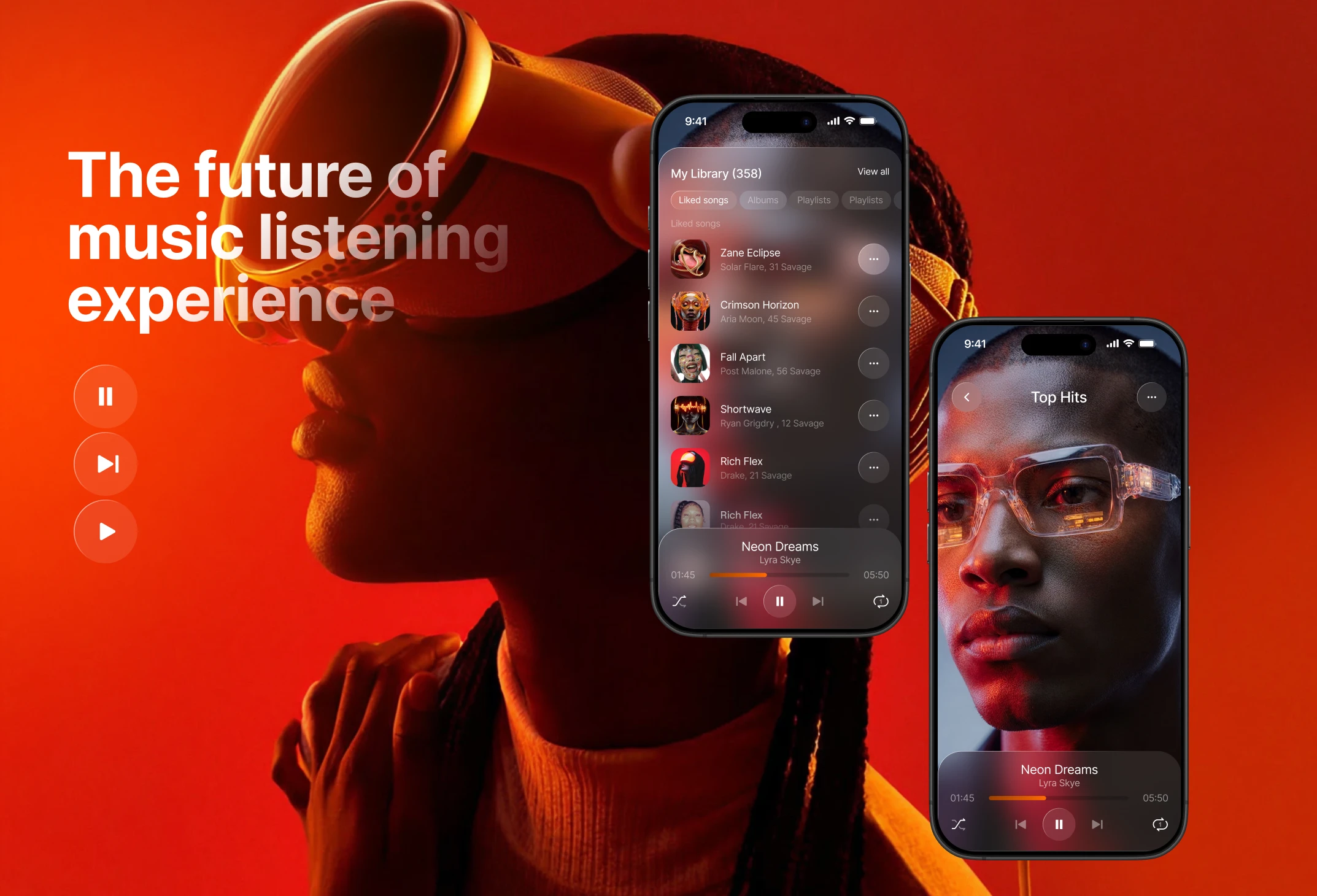
What I did
I designed the full dashboard concept around three simultaneous needs: discovery, playback, and library — all visible at once without feeling crowded. The hero section surfaces editorial playlists with full visual weight, while the right panel keeps the current track and personal library always in reach. Artwork is treated as the primary visual element throughout — large, atmospheric, and intentional.


Outcome
A concept that challenges the visual conventions of music apps — proving that warmth, depth, and cinematic energy can coexist with clean, functional UX.